The story behind our Logo
Back in 2005, looking for a ballet school for my two children, I realised that there wasn’t any close to where I live. The closest ones I saw were either too far, not RAD registered, or theater schools.
So in 2005, I decided to start saving to open my own Ballet school.
For 3 years, I slowly prepared paperwork, logistics, website and the marketing materials I would need when ready to open the School.
One of the exciting part of this preparation was the search for an original logo 😊
Back then I had decided to call our School “Hallsville School of Ballet” because we were based in Canning Town which was called Hallsville in the Victorian times.
With the help of my brother (Webmaster Consultant) I put my creative hat into doing something I had never done before: digital drawing, design and the world of marketing!
Throughout the years our logo has always featured the same dancer, which I painstakingly contoured out of a magazine to get her silhouette. I then imagined a lot of possibilities. Our logo could have been very different to what it is now…
I wanted our logo to represent:
- Growth
- Energy (of children)
- Balance
- Excellence
- Feminine and masculine sides
- And my favourite colour being purple, I was keen to have it featured in it too😊
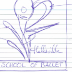
Opposit are some of my first tests…


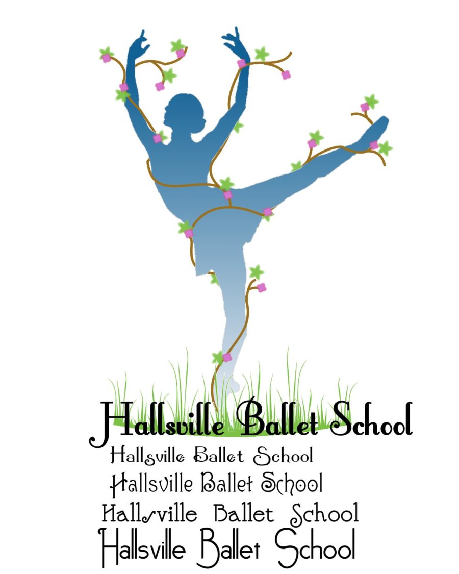

Above is our very first logo!

Having long fetch visions, I even had the idea to drop the dancer to keep only the ribbons!
In the end I decided that:
- Growth and energy would be represented by the same thing (the upward lines)
- Balance by the dancer herself who is balancing on her toes
- Excellence by the satin effect in the ribbons (which is also a trait of ballet, as ballet dancers wear ribbons on their ballet shoes)
- And the feminine and masculine by the choice of colours (pink for girls, red for boys, purple because I love it!) Those 3 colours became the colours of our school and are part of our uniform too, the 3 ribbons on our character skirts.
I wanted our logo to show elegant movement too and back then the curl was in my opinion a nice touch.
The choice of the font that would represent the school was a difficult one too.
I wanted it to represent.
- Elegance
- My French origin
- An academic rigorousness
- Plus, I wanted it to be relatively unique!

Over time, I realised that it needed improvement
and most of all, to be simplified because of its lack of practicality especially with the online medias.
The name of the school wasn’t included, it had too much details with the shadow and satin effect, didn’t fit in all the media sites (Facebook etc), the font wasn’t that easy to read. In short, it was clearly the result of an amateur work…
So once again, I put my thinking cap on and tried something different.
- It had to contain the name of the school
- Be easier to read
- Be suitable for our two companies (Hallsville School of Ballet and MyBallet Community, our charity)
- And simplified
So, I came up with a logo that we used for a short time as I wasn’t entirely happy with. I guess it was a transition logo to get to the logo we have now…
Through this designing process I learnt about marketing, colours, psychology, symbolism, Inkscape (the program I use for all my flyers, poster and logo making) and many other little things to take into consideration when marketing a dance school.
I am still an amateur, but I am so thankful for the personal growth I acquired in the process…
After having moved our school to Poplar and change our name, a new logo was a must.
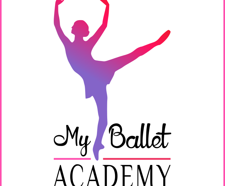
And today this is our logo.
Much simpler than the others and with a slightly different idea behind.
- We still have the 3 colours of the school
- The growth and energy are represented by the gradient in the dancer
- The Academic rigorousness, in the font for the word Academy (Philosopher font)
- The balance is still represented by the dancer herself, and being rid of all the lines around her, I believe it gives her a sense of growth as she is rising above the words
- It is in a square which works better with Facebook, Instagram and the whole lot! (but can be used without)
I also wanted to give it a more settled touch as our school is now 10 years old. The lines between the words MyBallet and Academy are representing the base we have grown from with the dancer rising above. I wanted a child touch too, which I put into the MyBallet word with the font Honey Llama…
If you browse through our pages, you will also notice its multiple facets as it doesn’t only represent the school, but our blogs, shop, Community etc!
Have a look and tell us where the difference lies 😊
Let us know what you think too! Could you make a logo for the MyBallet Academy better than the one I made? We are curious to see great ideas from you!
